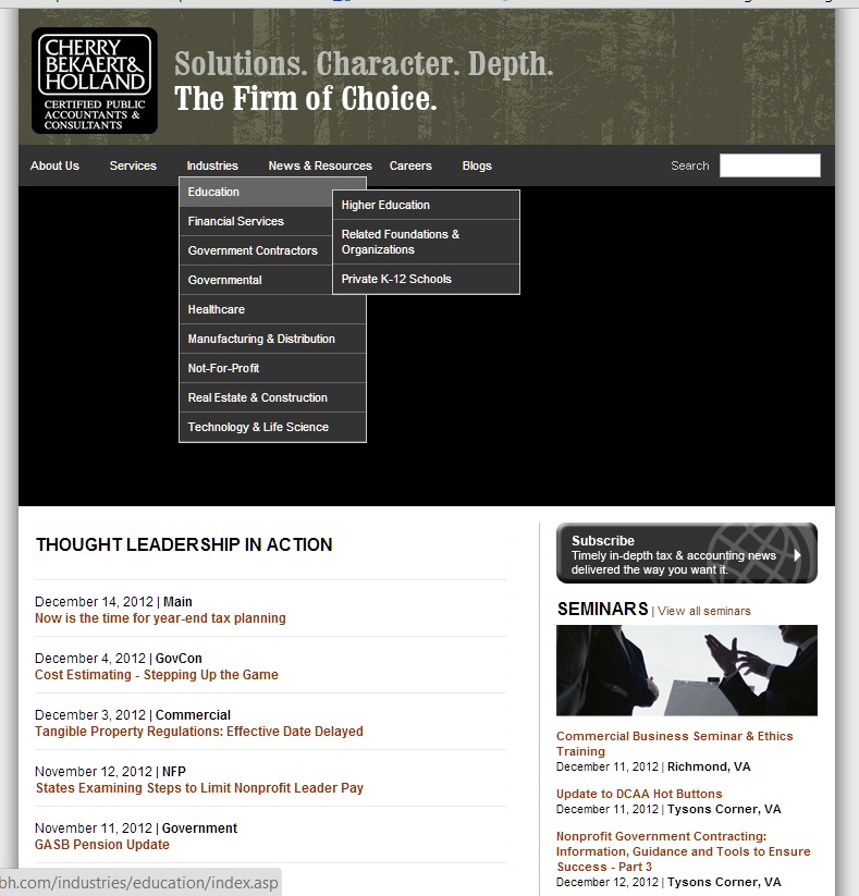
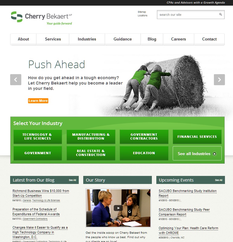
Cherry Bekaert rolled out a new look earlier this year and I have to say, the results are night and day. The company challenged professional services brand marketing firm Hinge Marketing with a re-branding project that would bring the Cherry Bekaert visual identity in line with the company’s role as a trusted partner in accounting and other vital business matters. The new visual identity also had to appeal to a national and potentially global clientele.
The tagline along with the new shortened company name, presented in a fresh new color palette and typeface, is modern but yet still approachable. The mark, a stylized version of the company’s initials, is dynamic, sophisticated but yet friendly. These elements are carried through in the website re-design and reflected in the images and color treatment. I was also pleasantly surprised to find WordPress as the underlying content management system.


New


Overall, this was a successful rebranding effort that brings a somewhat dated brand identity up to date without losing sight of the firm’s client.
Image by Gino Crescoli from Pixabay


